In the bustling world of online content, visuals are king. A compelling image can grab attention, set the tone, and enhance understanding. But getting images right across the myriad of devices readers use – from wide desktop monitors to narrow mobile screens – can be a real challenge. One common issue? Feature images that are so tall they push your carefully crafted headline and opening paragraph off the screen, especially on desktop.
Here at Dynamite Netball Club, we’re exploring solutions, and one aspect ratio is showing particular promise: 3:1. You might initially think of it as ultra-wide, almost panoramic. But this wider, shorter format offers some significant advantages for blog post images, particularly featured images, improving user experience on both desktop and mobile. Let’s dive into why.
First, What Exactly is Aspect Ratio?
Simply put, aspect ratio describes the proportional relationship between an image’s width and its height. It’s written as two numbers separated by a colon (Width:Height).
- 16:9 is standard for HD video and many desktop monitors.
- 4:3 was common for older TVs and some photos.
- 1:1 is the square format popularised by Instagram.
- 3:1 is significantly wider than it is tall – three units of width for every one unit of height.
The Problem: When Images Are Too Tall
Many common aspect ratios (like 4:3, or even 16:9 used vertically) can create usability issues, especially for the main image at the top of a blog post:
- On Desktop: A tall image can dominate the viewport, pushing the blog post title and, crucially, the first few sentences of your content “below the fold.” This means visitors have to scroll before they even start reading, potentially increasing bounce rates if they aren’t immediately engaged.
- On Mobile: The effect is often magnified. A tall image can consume almost the entire screen height, forcing users into a frustrating “scroll-past-the-picture” routine before they reach the text.
The 3:1 Advantage: A Wider Perspective
Adopting a 3:1 aspect ratio directly addresses these issues and offers several compelling benefits:
1. Keeps Content Above the Fold (Desktop)
This is perhaps the most significant win for desktop users. Because a 3:1 image is relatively short, it leaves ample vertical space. When a visitor lands on your blog post, they are much more likely to see:
- The full headline
- The featured image
- The beginning of your introductory paragraph
This immediate visibility allows readers to quickly grasp the topic and decide to continue reading, leading to better engagement. It prevents the feeling of landing on just a large picture with no context.
2. Improves Mobile Scrolling Experience
While mobile screens are vertically oriented, an extremely tall image is still detrimental. A 3:1 image, being inherently shorter, takes up significantly less vertical real estate on a mobile device compared to taller formats.
- Users scroll less to get past the image and into the content.
- It strikes a better balance, providing a strong visual hook without hijacking the entire screen.
- The panoramic feel can still be quite impactful, even on a narrower screen.
3. Creates a Modern, Cinematic Feel
The wide, letterbox-style format of 3:1 lends a modern, almost cinematic aesthetic to your blog posts. It feels intentional and can differentiate your content. This works particularly well for:
- Landscape photography
- Group shots or team photos
- Banner-style graphics
- Abstract visuals
4. Enhances Layout Consistency
By standardizing on a specific aspect ratio like 3:1 and using CSS (aspect-ratio: 3 / 1;) to enforce it, you create a more predictable and consistent visual rhythm for your blog. Users know what to expect, and your design looks cleaner across different posts.
5. Focuses Composition
The constraint of the 3:1 ratio encourages thoughtful image selection and cropping. It forces you (or your theme) to focus on the key horizontal elements within the image, potentially leading to more impactful visuals that draw the eye across the frame.
Important Considerations
While 3:1 offers many benefits, keep these points in mind:
- Image Content: It’s not suitable for all images. Portrait-oriented subjects (like a single person standing) will be heavily cropped or appear very small. Choose your images wisely.
- Cropping: You’ll need a consistent cropping strategy. Use image editing software before uploading, or leverage WordPress’s image editor. You can also define custom image sizes in your theme (
add_image_size) that enforce this ratio, combined with CSSobject-fit: cover;to handle how the image fills the space. - Theme Support: Your WordPress theme needs to display the images in a way that respects the intended aspect ratio. Modern themes using the CSS
aspect-ratioproperty are ideal. If not, you might need custom CSS. - File Size: Always optimize your images for the web, regardless of aspect ratio. Wide images can still be large if not compressed properly.
Getting Started with 3:1
- Image Editing: Crop key blog images (especially featured images) to a 3:1 ratio using your preferred tool.
- WordPress Settings: Consider defining a custom image size in your theme’s
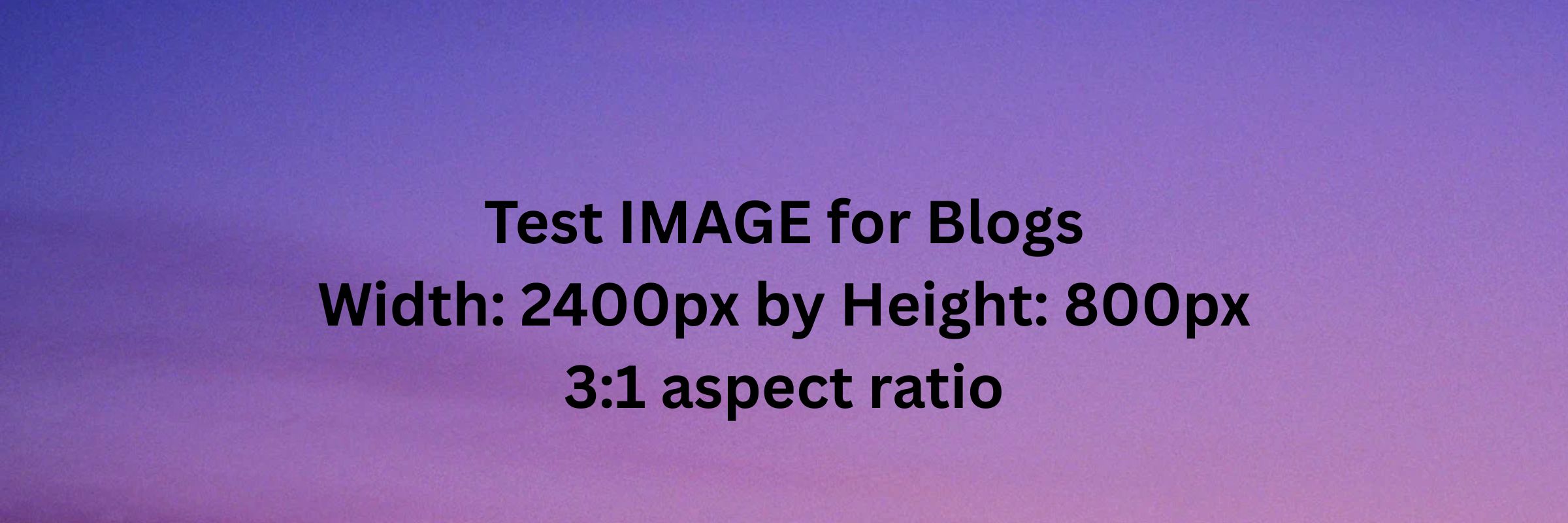
functions.php(e.g.,add_image_size( 'blog-feature-wide', 2400, 800, true );– 2400×800 is 3:1,trueenables hard cropping). - Theme CSS: Ensure your theme’s CSS applies the
aspect-ratio: 3 / 1;property to the image container or theimgtag itself, potentially along withwidth: 100%; height: auto;andobject-fit: cover;.
Conclusion: A Wider View Worth Taking?
Switching to a 3:1 aspect ratio for your primary blog post images isn’t just an aesthetic choice; it’s a strategic decision that can significantly enhance user experience. By keeping crucial content visible above the fold on desktops and reducing scroll fatigue on mobile, you make your content more accessible and engaging from the moment a visitor arrives.
While it requires careful image selection and implementation, the benefits of a cleaner layout, improved readability, and a modern feel make the 3:1 aspect ratio a compelling option worth testing for any WordPress blog. Give it a try and see if this wider perspective works for you!